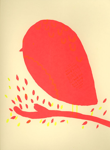
So here is my final little bird!!! The other colors are so subtle and I really enjoy it.
Here it is with the contrast boosted way up, so you can actually see the other colors: 
I start my new/old job tomorrow, and I am very very excited about it! Except, I have come down with an evil sinus infection and sore throat. I will be very upset if I have to call into work on my FIRST DAY!
Monday, May 18, 2009
red bird
Thursday, May 14, 2009
it left a bad taste
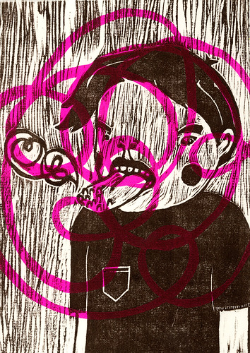
This is a silkscreen and woodcut. I made it for the Print Zero exchange. I am finally participating in it after being asked to for 3 years in a row!
This piece is a little darker than my usual work. I am not entirely sure what its about. Maybe about something that you used to like that now reminds you of something bad. Or maybe something as innocent as forgetting to brush you teeth in the morning.
By the way, I quit my job and now I have a new job! Hooray!
Friday, May 8, 2009
bird wing
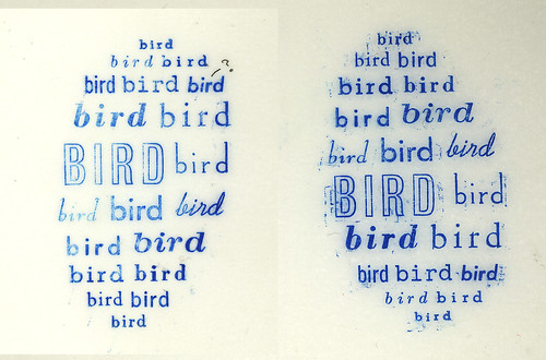
In the Continuing Letterpress class that I am taking at Pratt (taught by the wonderfully amazing Miss Lisa Hasegawa), we learned about proper justification of type with this exercise - create a shape out of type.
I had high hopes and big dreams for this - my original setup took me several classes to set - 8pt Spartan type with a multitude of facts telling you all about birds.
But, we are nearing the end of class. Next week is our last class, and I was falling behind. So I scrapped it and made this guy out of 20 different faces/sizes, and I am way happier with it than I was with the original.
I decided to go with the shape on the left. What do you think?
Subscribe to:
Posts (Atom)
